I was hired to make ongoing content updates to two WordPress websites for an investment consulting company. While making these updates, I took note of some UX issues that needed improving. Two major red flags were images containing large amounts of vital information about the company and product, as text in the images. I knew this was bad for accessibility, so I needed to get that text to be actual text instead. Another problem with those images is they didn’t work well when scaling to smaller screen widths. Note that the two pages being shown here are from two different websites within the company; I wouldn’t want such different color palettes on the same website.
Problem Images
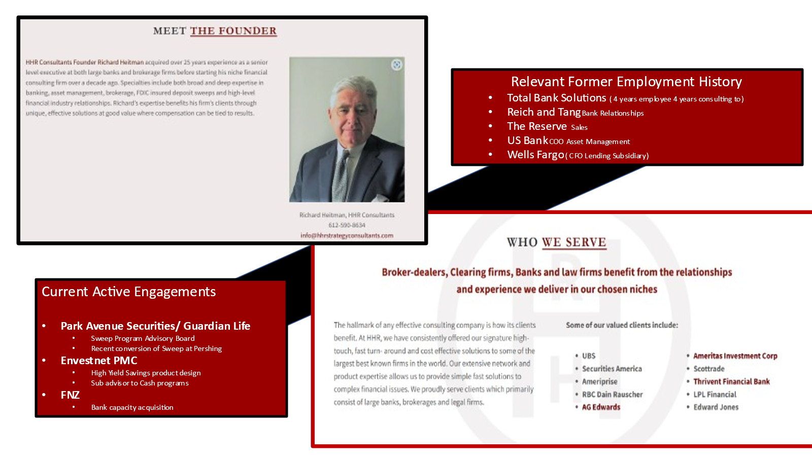
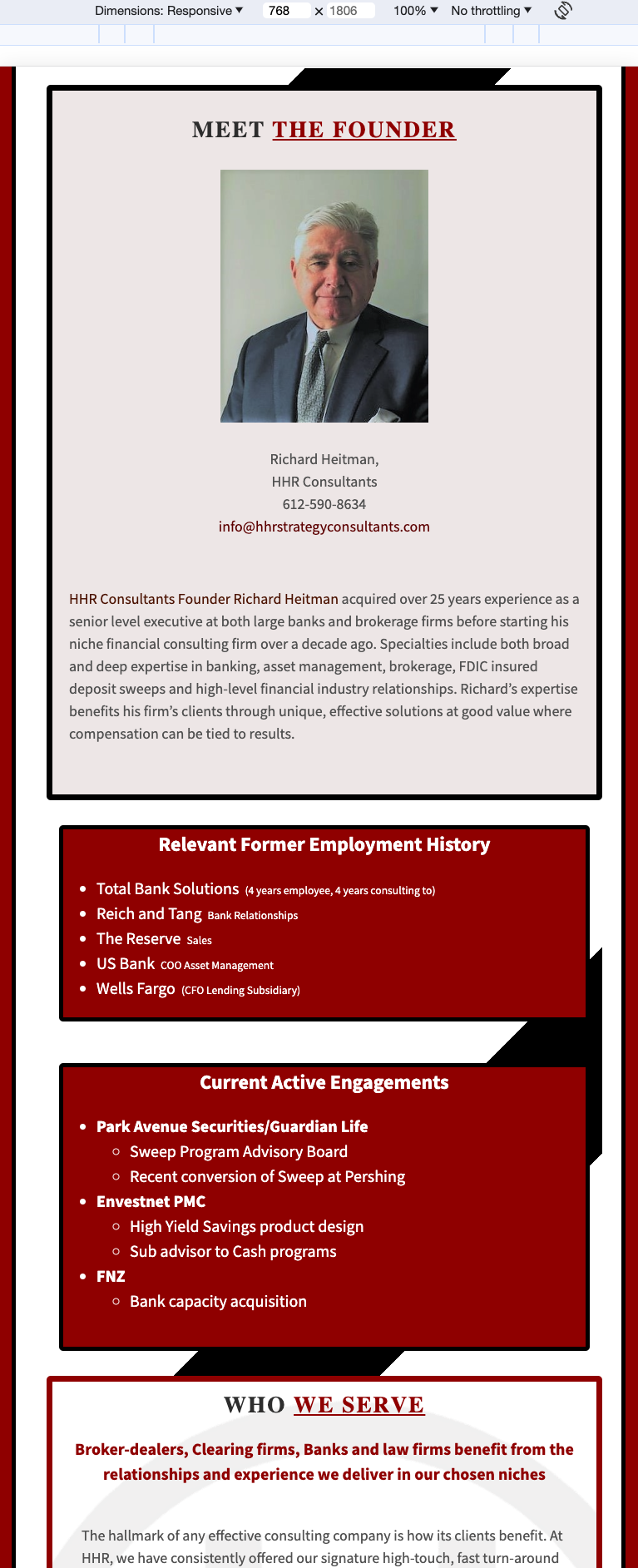
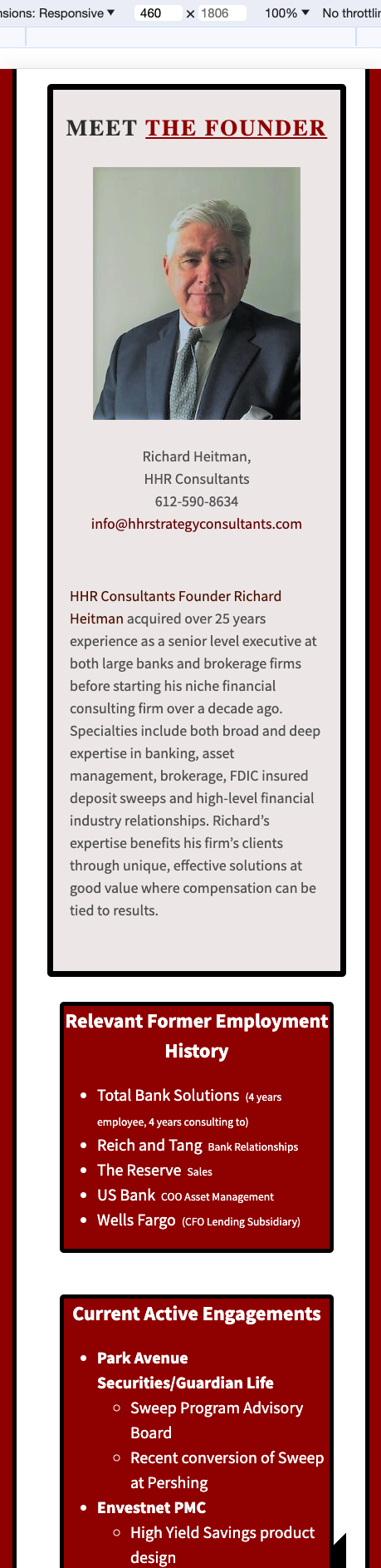
This is the image that was serving as the company’s “About” page.
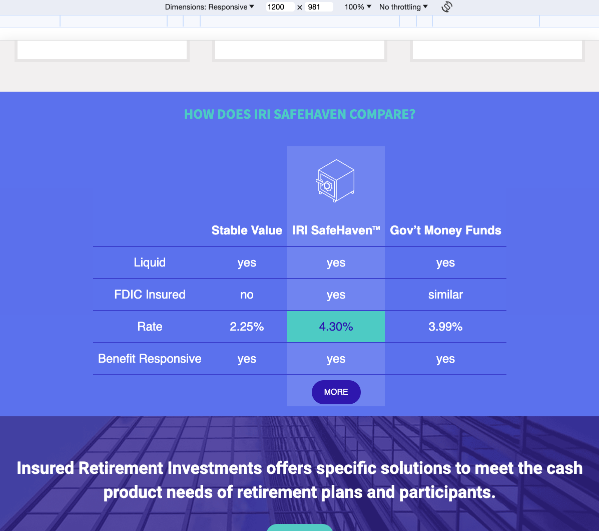
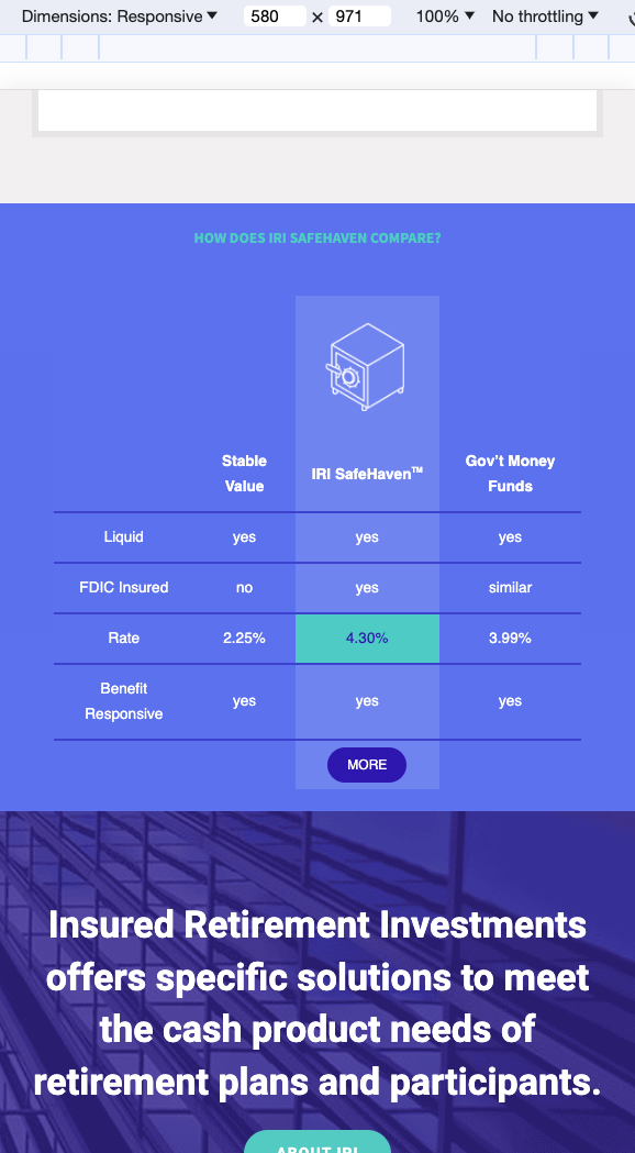
This next image gave potential customers rate comparisons to help make a decision about the investment product.
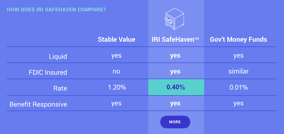
Accessibility aside, these images are readable on desktop screens, though the first one is blurry at its original size. Viewing them on a mobile device or reducing the desktop screen width quickly illustrates the need to come up with a solution for the mobile user experience.
Solving with CSS
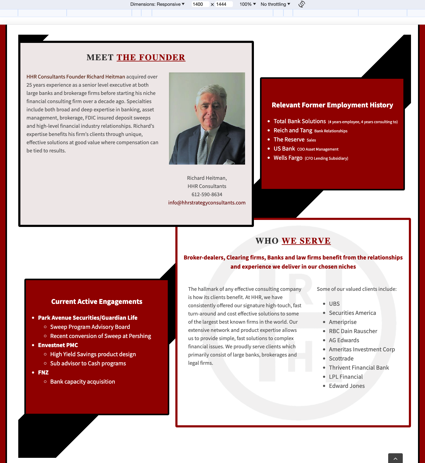
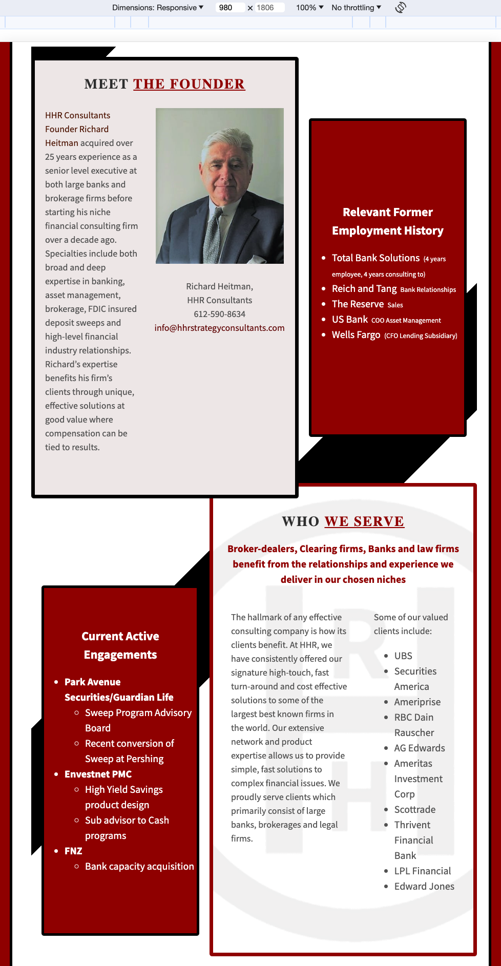
First, I found a WordPress plugin that allowed for custom CSS styling. Then I replicated the visuals of the images, using HTML and CSS. This allowed me to control the responsive behavior of the content with media queries, and it allowed the text to be actual text on the page for accessibility.
“About” page at four screen widths
Rate comparison chart at three screen widths
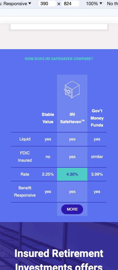
Now the important information is both easier to read on any size device, and accessible for screen readers, ensuring those with visual impairments are able to get what they need from the pages.
 Brian Palay