Marketing Campaign Landing Page for Surgical Devices
The stakeholders for this project, my team’s marketing strategists, use landing pages for marketing campaigns for our surgical incision management devices, which are designed to help patients recover from surgery. The goal of the landing pages is to generate sales leads by getting users to fill out forms on the page and provide us with their contact info, the type of work they do, and type of product they need.
These landing pages, which live at a separate domain from our main website, are typically built by a marketing automation specialist (not a UX designer), using pre-fabricated templates for the content provided by the marketing strategists. The templates are simple, usually consisting of a hero image with text at the top, a single image in the main body, some areas for text, and a contact form, seen in the following screenshot.
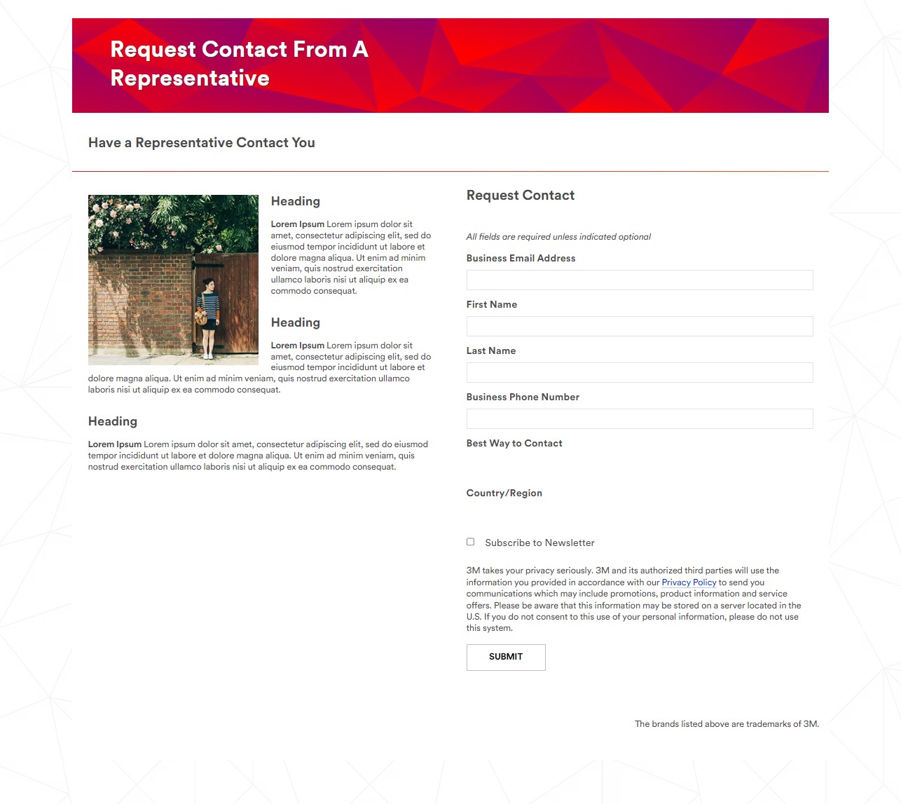
The marketing strategists were becoming frustrated with the lack of customization and unexciting visuals of their campaign landing pages, so they asked me to help with this since they knew I had a background in web development. In addition to the templates, a built-in code editor could be used to build from scratch, and they wanted my help to make the pages more interesting, and hopefully create more effective marketing campaigns. So for these pages, I worked as both a UX designer and a front-end developer.
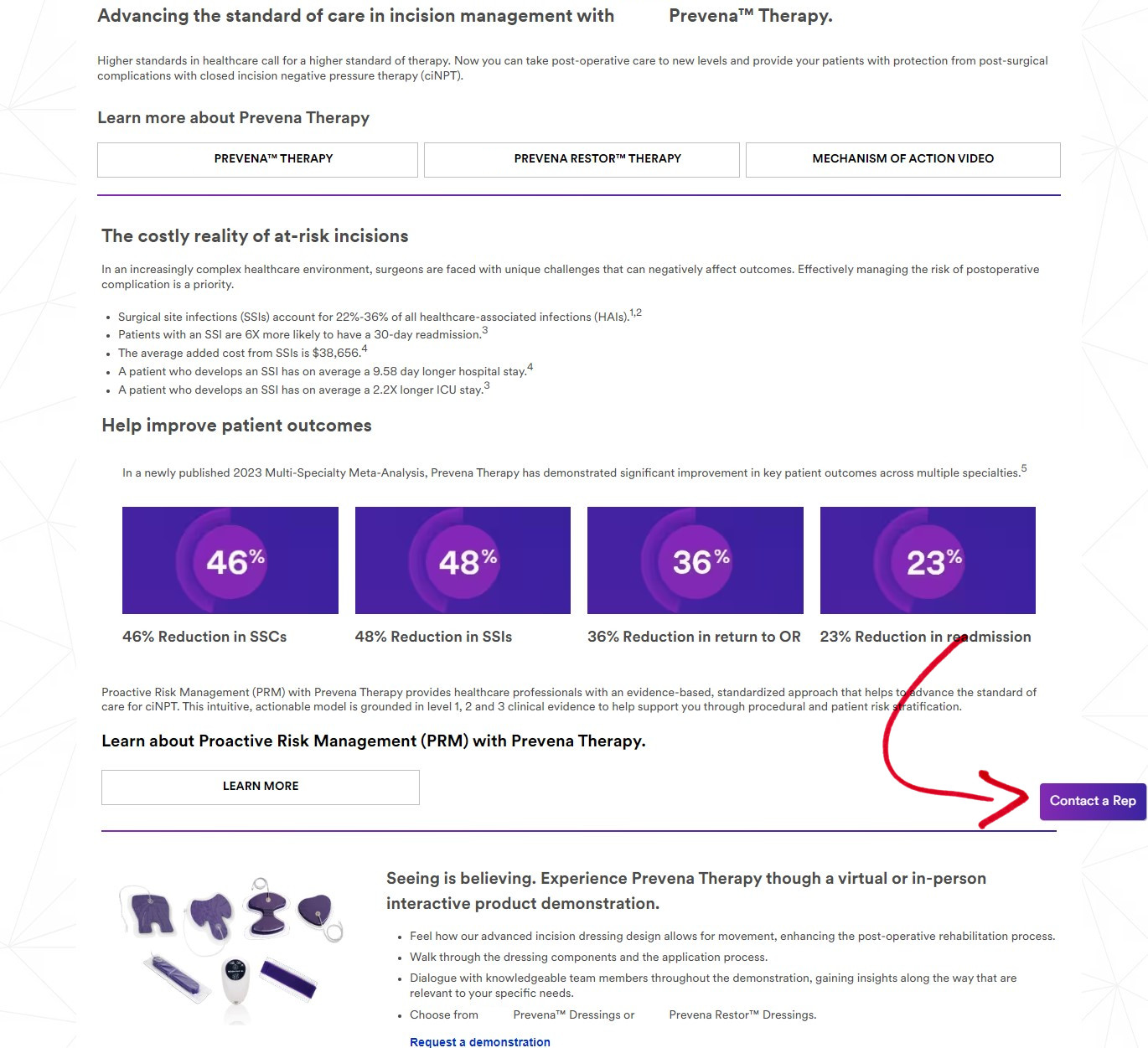
The following page is one example of this type of work I did. The marketing strategists and I had meetings to discuss content and iterate layouts that would allow them to include everything they needed. I incorporated many elements from our main website’s design library, which allowed us to add more image and video content while keeping things on-brand. Additionally, I felt the white form got lost on the white page, so since form submissions are the goal of these landing pages, I gave the form a light gray background to make it stand out and look more polished. The next screenshot is my design.
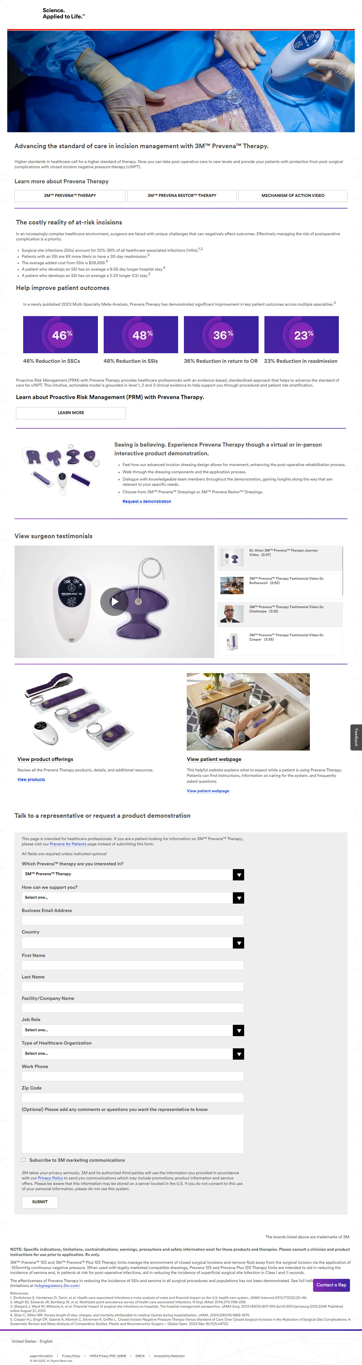
Next is a screenshot near the beginning of the page, where the user is met with lots of information to take in, and likely not thinking about the form at the bottom of the page that will help them get in touch, and help the marketers get an important sales lead. We came up with a solution that consists of a JavaScript “Contact a Rep” button (marked in the screenshot by a red arrow) that stays in a fixed position on the screen as the user scrolls, and it links to the form. I gave the mobile and desktop experiences their own button styles and placements, such that the button is noticeable, but not in the way – as if to consistently but politely remind the user of the task to complete.
Improvements like this became standard on my team – and within a large corporation, unique to my team – and for subsequent landing pages, the marketing strategists had me implement similar designs and features to improve their campaigns.
Informational Hub for Surgical Specialists
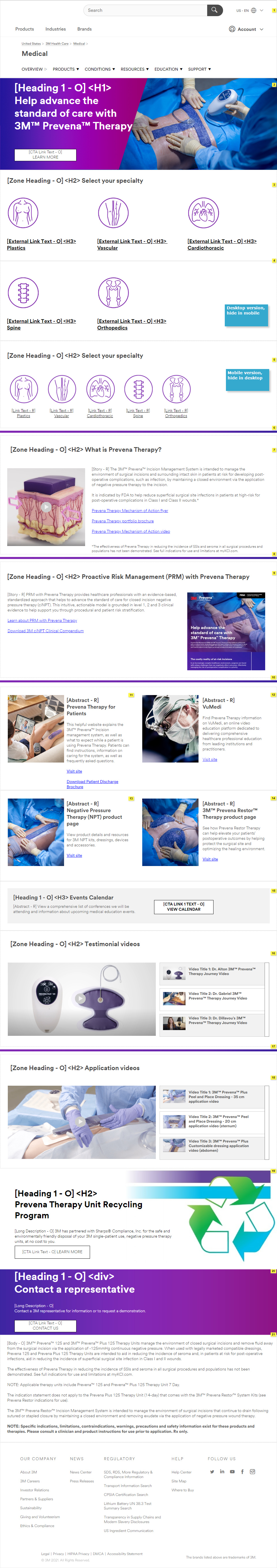
This was a project working with my team’s marketing strategists as stakeholders, who needed to create a centralized place where surgeons of various specialties could gain knowledge about how our products could help their patients. We also included ways to get in touch with a sales representative. The project consists of a home page and five specialty pages. Surgeons can view testimonials, brochures, application videos, and links to related pages. Here, we will focus on the home page and one specialty page as an example.
During this project, mobile-first thinking became important, and that is the focus of this summary of the work. Our corporate UX templates were designed primarily around on desktop layouts, with each section of the page existing in a prefabricated desktop layout, as well as a corresponding mobile layout when viewed on mobile devices. During the iteration process, I noticed that some sections looked great in their desktop layout, but not so great in their mobile layouts, which would present a compromised user experience in mobile. And research showed that a majority of surgeons viewed our existing pages on mobile devices.
To solve this, I remembered the CSS “display” property from my web development certification course. I knew if I was coding a page from scratch, I could show or hide elements, using “display: none,” “display: initial,” and media queries. When I asked the development team if we could do something like that, most had never done it on a project, but it turned out they could. So I created separate versions of some sections where needed, unique to the desktop and mobile experiences, assigning each to be considered the “desktop version” or “mobile version” of that section.
This is a good time to suggest viewing both versions of the screenshots throughout this entire portfolio, by either holding a mobile device vertically and horizontally, or changing the width of a desktop browser.
In the screenshots below, the blue notes on the wireframes let the development team know what to show/hide and when. One such place is on the home page, the section with the specialty icons. The desktop version provided just what we wanted, with large and clear icons to click, but in mobile, these icons took up so much vertical space, a user would need to scroll quite a bit just to get to the end of the specialty menu. So I found a different section from our design library, with much smaller icons, and I made that the mobile version of the specialty menu.
Home Page
Plastic Surgery Specialty Page

 Brian Palay